Establishing branding/
through a company website re-design
Company / WSIB Labs
Role /Sole Designer with 5 Engineers
Type /Branding, UX Research, UI Mockups
Timeline / October - December 2018
through a company website re-design
Company / WSIB Labs
Role /Sole Designer with 5 Engineers
Type /Branding, UX Research, UI Mockups
Timeline / October - December 2018
Final Prototype
The Workplace Safety Insurance Board is Ontario’s workplace compensation board. WSIB Labs was created as a innovative hub with a start-up environment that could challenge and accelate growth for their corporate counter part -- not an extension of Coporate WSIB.
When I joined the Innovation lab, it was still in its beginning stages and did not have its own distinctive branding separate from its corporate counterpart. At the time, WSIB labs had many interesting internal projects but its only user facing product was a website which listed the lab’s areas of exploration with a general description.
Design process I followed for this project
The problem was presented to me as simply “we need a new website” by the Lab Director. From this starting point, I performed a root cause analysis to this problem.
“Why did we need a new website?”
The current website lacks an aesthetic appeal and only showcases our projects on a minimal level
“Why do we want a pretty website with details on our project?”
When job applicants visited the website, they thought WSIB Labs was the same as Corporate WSIB. This led them to think WSIB labs had a legacy work environment and worked on Corporate projects.
“Why did we want to differentiate the Lab from Corporate and show different projects?
The creation of the Lab was to spark innovation for WSIB, not to act as an extended department working on existing WSIB projects. The Lab is supposed to generate disruptive solutions to current problems.
From these questions, I was able to identify that WSIB labs needed a new and distinct branding rather than just a simple UI change for the website.
The Lab’s lack of identity caused misunderstanding of the Lab’s functions and work environment
Now I had a general problem space, I kept on digging “why did they think that”?
This project was assigned to me during the perfect timing of co-op interview season, so I had access to 30 users to question. I prepared a list of questions focusing on our company and website, including what they think an innovative start-up should resemble.
Through interviewing both current employees and incoming interviewees and researching some fellow innovation labs I gained the following paint points:
Corporate WSIB had well established branding
The name WSIB has always been associated with the long and teneous process of the traditional insurance industry.
Lack of information about WSIB labs
The information on the current website lacked the ability to showcase events and projects at WSIB labs.
Users had pre-conceived idea of being “legacy”
Users define a good company as having a pleasant workplace relating to the words “fun” and “agile”
General industry not established
The general functions of an innovation lab does not have a solid definition across the board
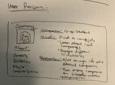
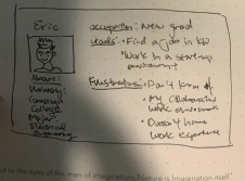
From the user research I was able to quickly form two user personas in order to have a clear representation of the two different variations of users: Co-op students job seekers looking to enter the tech industry, and new grad job seekers looking for a company with start-up like environment.


These user personas helped me have a clearer image of the user base and better identify with the user. Creating these personas also aided in the HMW questions later on, as I was able to see distinctly if both types of users would benefit from the changes.
To establish a brand for the WSIB innovation lab separate from the corporate counterpart that showcased the Lab’s innovative projects and start-up like work enviroment.
Constraints
Assumptions
Defining sucess
Before my brainstorming session, I identified what a sucessful redesign means to avoid straying from the core problem. So how do I know that I have solved the problem?
Quantitative Success
Increase the number of users who are able to identify the working environment and project type of WSIB Labs
Qualitative Success
Decrease the observed frustration of user when navigating the website
Upon finishing the problem definition, I started brainstorming for a solution. Due to the contraints of the NDAs and our Lab director’s request to re-design the website, I digital solution came to fruition in the form of a website.
How might we?
Before hopping onto the re-design, I looked at competitor websites and other websites aimed at the target users (University students). From that adventure, I identified a few attractive and possibly definitive traits of a “young and fun” organization’s website. I compared the Lab’s current website side by side to the top websites and found some short-comings.
Example landings pages I researched
Welcoming landing page
Both example websites above had taglines on their landing page. It was not only a page to show information about their sites -- it welcomed users to the site.
Bright Colors
Color theory is a very interesting realm that I got to explore a bit while researching for this project. The two examples both used colors that are often assiociated with “happy” and “youthful” rather than a more “serious” color palette.
WSIB Lab's old landing page
Information overload
The old website was a very ambitious project. It displayed a multitude of animation techniques and had an intensive list of projects and research the Lab was working on. Although that was great at showing what we did, the overload of information often also created confusion in the users. Did we do projects or were we a research lab?
User Flow
Given the infomation overload, I needed to highlight the important projects and focus on giving the user a more direct view of what the Lab is up to. So, I proceeded to create a brand new user flow to simplify the user journey.
User flow for website re-design
For the prototypes, I created three prototypes with distinctive styles and asked fellow co-op students at the Communitech collaborative working hub to test out. Out of the 30+ users we asked, 27 chose this green-themed design
Final Prototype
Youthful color choice
I chose to replace the original dark blue color with a leafy green color palette as it represented a youthful and growing nature, simultaneously keeping it aligned with the corporate colors. The blue color was originally chosen so the Lab could be more easily distinguished. From the user interviewed, I learned that the blue gave off a “serious” and “formal” impression. However, I felt the desire to distinguish the Lab could also be achieved by using shades of the same color to ignite another atmosphere for the user
highlighting projects
Rather than focusing on our co-working workspace like the previous website, I changed the direction to showcasing the Lab’s top projects. These projects distinguish the Lab from the traditional legacy corporate WSIB and naturally examplifies the Lab’s agile practices
Establishing design consistency
Another problem I discovered while exploring the Lab’s lack of branding was that the Lab did not have a design guide that gave the website or projects consistency . Thus, I built on top of the new website’s style guide I created and worked on setting up a more dynamic design system (unfortunately did not fully complete before ending my internship, but it was used throughout a couple of the Lab’s new projects at the time)
Measuring Success
After interviewing a new batch of workers at the ever so diverse Communitech, I am happy to conclude that upon testing the new website to the former, the website successfully garnered quantitative and qualitative success as definied previously.
Quantitatively, out of 30 interviewees, all 30 interviewees were able to correctly identify the work environment and type of projects done at the innovation lab (agile and rapid prototyping projects)
Qualitatively, no interviewee struggled to navigate or had any questions regarding the navigation of the website -- a stark comparision to the 6 users who had problems finding sections in the previous site.
Unbiased feedback
Since all users I interviewed were others who worked in the same building, people were biased towards their pre-established understanding of an innovation lab. In addition, since they were already aware of the Lab and were friendly as collegues, a lot of the feedback could have been masked by the interviewee’s politeness
scalability in design
The entire problem space and explorations was a huge wake-up call for me which is to always keep scalability in mind. We must establish a dynamic style guide when designing a flagship product for any company so the branding is certain and can be re-used throughout other projects.
Accessible design
Moving forward, I also want to focus on ensuring the accessibility of my designs as I noticed the old website did not comply with WCAG 20 AA compliance or the AODA guidelines